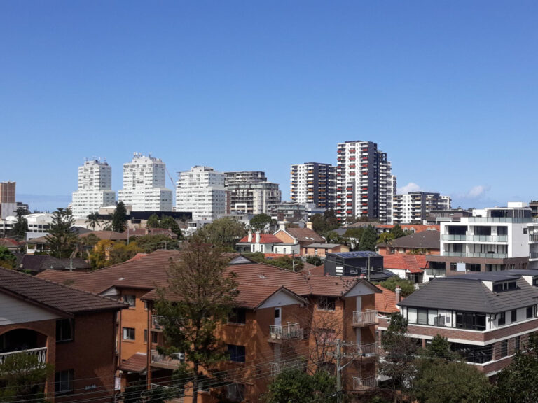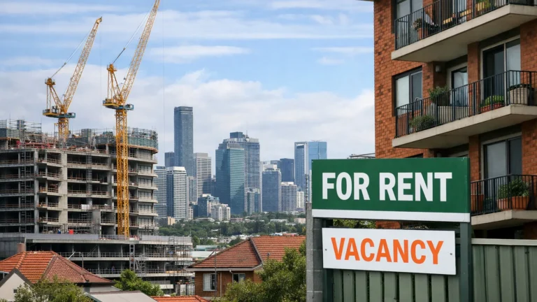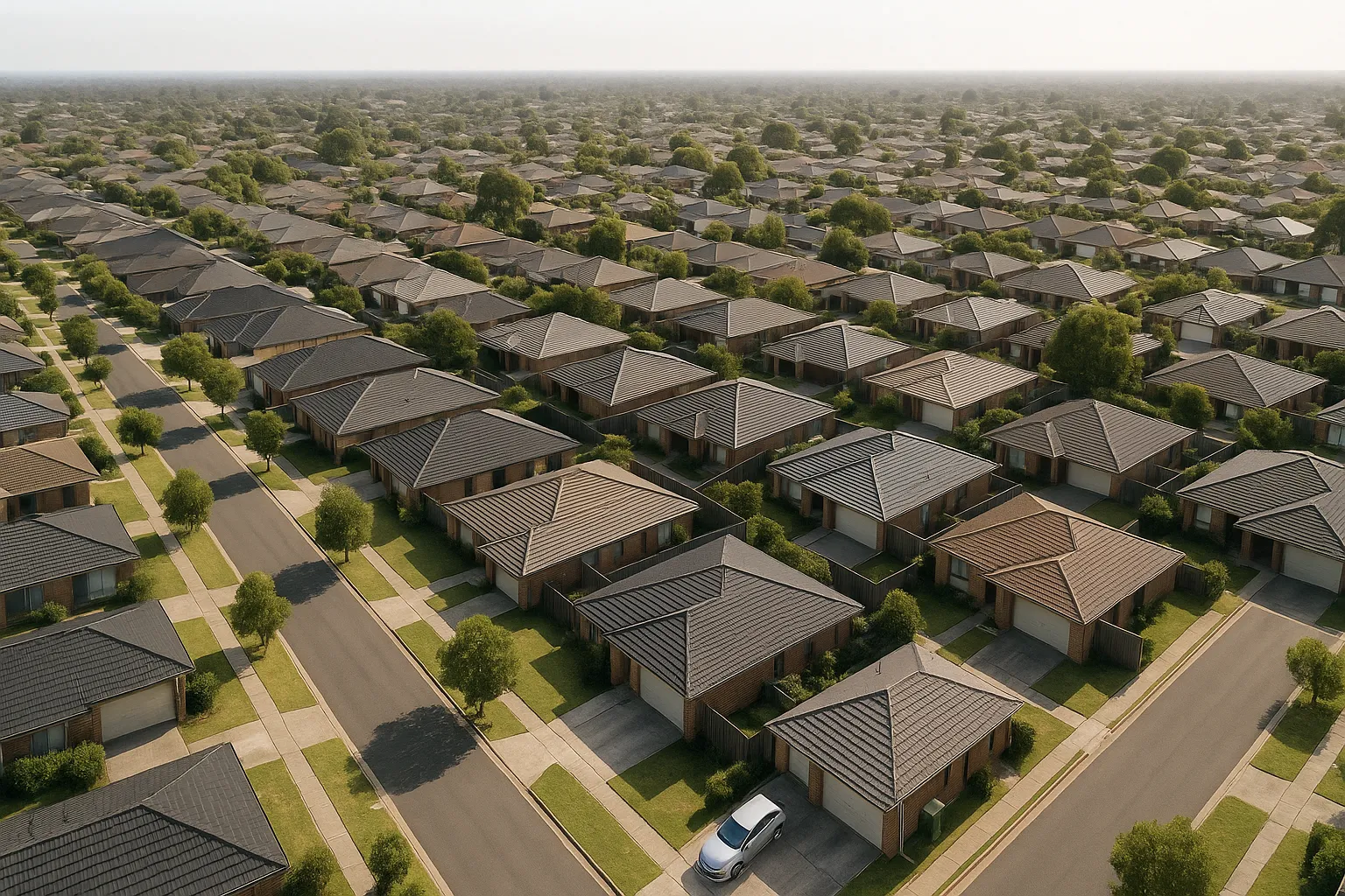
A sharp rise in sale listings is appearing in pockets across Australian capital cities. The pattern is uneven, some suburbs are adding stock at twice the usual rate, while neighbouring areas remain tight. The immediate question for buyers and sellers: is this just seasonal noise, or are specific suburbs showing early signs of sustained price weakness?
The answer depends less on the listing spike itself and more on what sits beneath it. Suburbs with rising inventory share common structural traits, distance from core employment centres, price points that stretched affordability limits during the recent peak, limited public transport access, or heavy exposure to investor-driven demand. When these factors align, a supply surge can turn into a price correction.
Where inventory is climbing fastest
Suburbs recording the steepest listing increases tend to fall into three broad groups. Outer-ring locations, typically 35-50 kilometres from the CBD, where commute times exceed one hour and infrastructure upgrades remain years away. Mid-tier investor hotspots where yields compressed during the recent price run and cashflow no longer stacks up against rising rates. And prestige pockets where prices climbed 40-60 per cent in two years, outpacing wage growth and leaving a thin buyer pool.
The common thread: demand was price-sensitive, not structural. When serviceability tightened and sentiment shifted, sellers appeared faster than buyers.
The structural factors that explain vulnerability
Distance from employment remains the clearest predictor. Suburbs beyond the 30-kilometre radius face longer approval times for rezoning, slower infrastructure rollout, and thinner buyer demand when credit conditions tighten. Price bracket matters too, suburbs where median prices sit 20-30 per cent above long-run income multiples are seeing listings rise as stretched buyers step back.
Infrastructure access amplifies the gap. Suburbs with planned but unbuilt rail extensions or highway upgrades priced in future connectivity during the boom. As timelines stretch and budgets tighten, that premium evaporates. Investor concentration is the final lever, areas where 40-50 per cent of stock is investor-held respond faster to yield compression, with owners listing when cashflow turns negative.
The catch
- Listing surges don’t guarantee price falls, clearance rates and days on market matter more than volume alone
- Suburbs with strong fundamentals (schools, transport, employment proximity) absorb inventory faster
- A 20-30 per cent rise in listings can still sit within normal seasonal variation if the base is low
- Price falls depend on whether supply is met by distressed sellers or patient owners testing the market
How inventory translates to price pressure
Rising listings create downward price pressure when three conditions align: sellers need to transact (mortgage stress, relocation, investment exits), buyers have limited serviceability (rates high, credit tight), and the stock increase persists beyond one quarter. A temporary spike, say, 15-20 per cent over eight weeks, often reflects seasonal patterns or a backlog from prior months. A sustained rise of 30-40 per cent across two quarters signals a structural shift.
The timeframe matters. Listings that clear within 30-45 days indicate healthy absorption. Stock that sits beyond 60 days forces price reductions, particularly in suburbs where buyer depth is shallow. The gap between listing volume and clearance rate is the signal to watch.
Scenarios and what could shift them
Base case: suburbs with structural vulnerabilities (distance, stretched affordability, thin infrastructure) see modest price declines of 5-10 per cent over 12-18 months as inventory normalises. Upside scenario: rate cuts arrive sooner than expected, serviceability improves, and buyer demand absorbs the supply within two quarters. Downside scenario: unemployment rises, forced sales increase, and inventory continues climbing, price falls accelerate to 15-20 per cent in the weakest pockets.
The variables to track: job security in overweight industries (construction, retail), infrastructure funding announcements, and whether clearance rates stabilise or continue falling. If housing supply hits seven-year highs while clearance rates collapse, the pressure compounds.
What to watch in the next six months
Days on market is the leading indicator. If median time to sell stretches from 30 days to 50-60 days, price reductions follow within weeks. Vendor discount rates, the gap between initial listing price and final sale price, signal urgency. A rise from 2-3 per cent to 5-7 per cent indicates sellers are chasing the market down.
Auction clearance rates below 50 per cent for three consecutive weekends in a given suburb confirm weak demand. Withdrawal rates, listings pulled without selling, above 15-20 per cent suggest sellers are waiting for better conditions, which can delay price discovery but doesn’t prevent eventual falls.
Practical steps if you’re buying or selling now
Buyers: focus on suburbs where listing volumes are rising but clearance rates remain stable, that’s where negotiating power is strongest without systemic risk. Run the numbers on distance, transport access, and infrastructure timelines. If a suburb ticks two or more vulnerability factors, price another 5-10 per cent below current asking.
Sellers: if your suburb is seeing a listing surge, price at or slightly below recent comparables to clear within 30 days. Waiting for the market to recover works only if you’re not forced to sell and can carry holding costs for 12-18 months. If cashflow is tight, exit early rather than chasing a falling market.
For weekly updates on where inventory is rising and what it means for pricing, subscribe to the Australian Property Review newsletter.
General info, not financial advice.